
Day Price Curves: Beyond Fowl
Casting out to the edges of our map where ducks become dragons

More experiments with developing ideas and free data. If you spot mistakes or can think of improvements or have context to share, please leave a comment. Become a full subscriber to see the full range of past experiments and to stay up-to-date as they develop.
High PV-generation causes prices to drop mid-day. The result in price charts, according to some, can look like a “duck.” That’s the standard story. The aim of this post is to show that plotting average prices against the time of day is useful, but that it’s time to move beyond fowl shapes.
Theories are nets cast to catch what we call 'the world': to rationalize, to explain, and to master it. We endeavor to make the mesh ever finer and finer. (Karl Popper)
Predictably, a rise in solar is bringing attention back to negative prices, spreads, and duck curves. The season has started. I’ve also noticed an increase in the number of pronouncements on the need for regional pricing and market design.
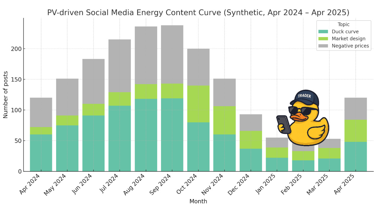
But posts about ducks are inevitably the most popular. To adapt the wise words of Charles Dickens: Load the grid under the same constraints and you'll see the same tortured dispatch and social media patterns unfold again, and again.1 This video is fairly accurate in showing my own relationship to the duck curve. I hate it, but I love it,2 really. Let’s change the music.
Today we’ll start from day-price curves and cast out, which will take us to an analysis of two special days in the German energy market and grid so far this year.
Hypotheses are nets: only he who casts will catch. (Novalis quoted by Karl Popper)
