
Seasonal Revenue/aFRR orbit
Time-Series in XY Space: getting dizzy with it.

Very exploratory/experimental data analysis. Round and round with different y-axes.
Let’s see if we can push the connected scatter plot further.
Start with the inverse relationship that runs like clockwork every year: when the aFRR NEG 08-12 capacity price is high, ID prices are low. When aFRR capacity is cheap, ID prices sit higher. Both link to solar generation intensity. When the sun is strong, the grid needs downward flexibility in the morning hours, which makes negative aFRR capacity valuable and suppresses spot prices simultaneously.
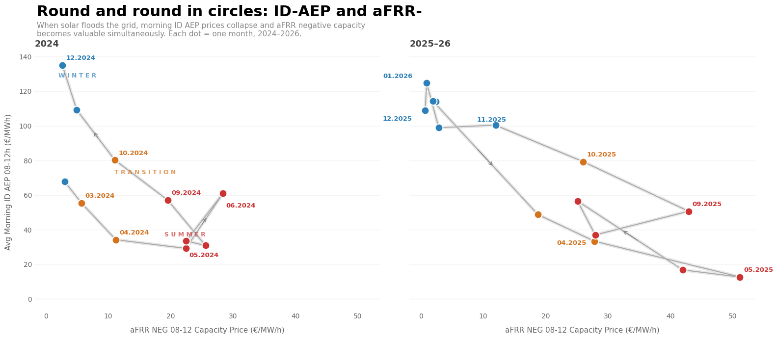
The chart traces this seasonal cycle — a diagonal sweep from upper-left (winter) to lower-right (summer).
